Responsive Data Visualisation
Description
Responsive web design is a powerful new approach to designing web sites. A single design under a single URL adapts (responds) to the characteristics of the end user's device. Responsive visualisations do more than simply scale freely. They adapt their form, layout, and interactivity according to the available space and characteristics of the display device.
Examples
Try opening the examples on different devices and/or resizing the browser window to make it narrower and wider.
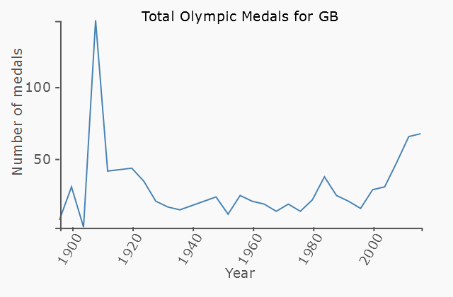
Responsive Line Chart
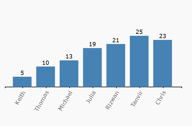
Responsive Bar Chart
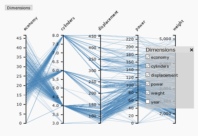
Responsive Parallel Coordinates
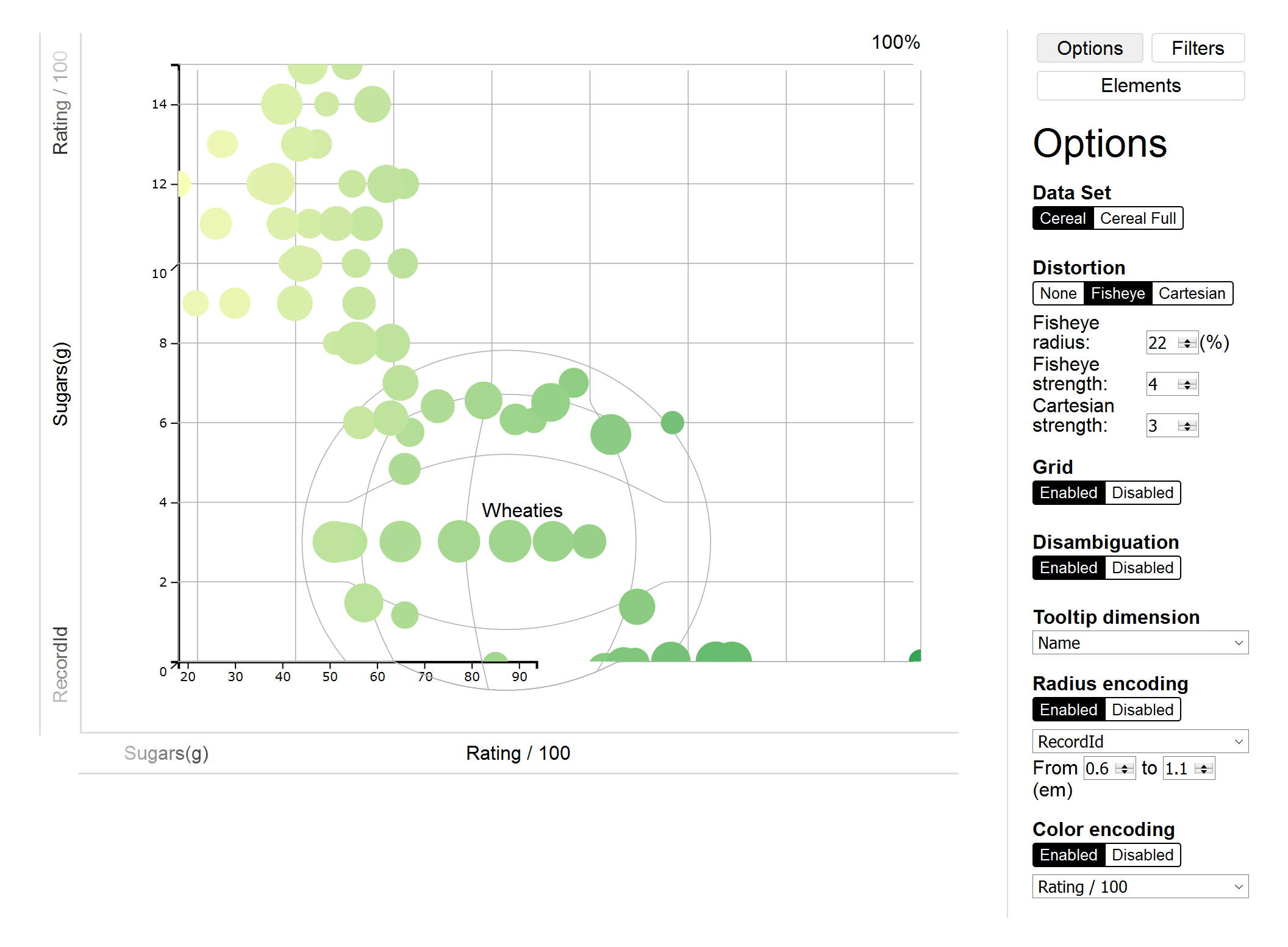
Responsive Scatterplot
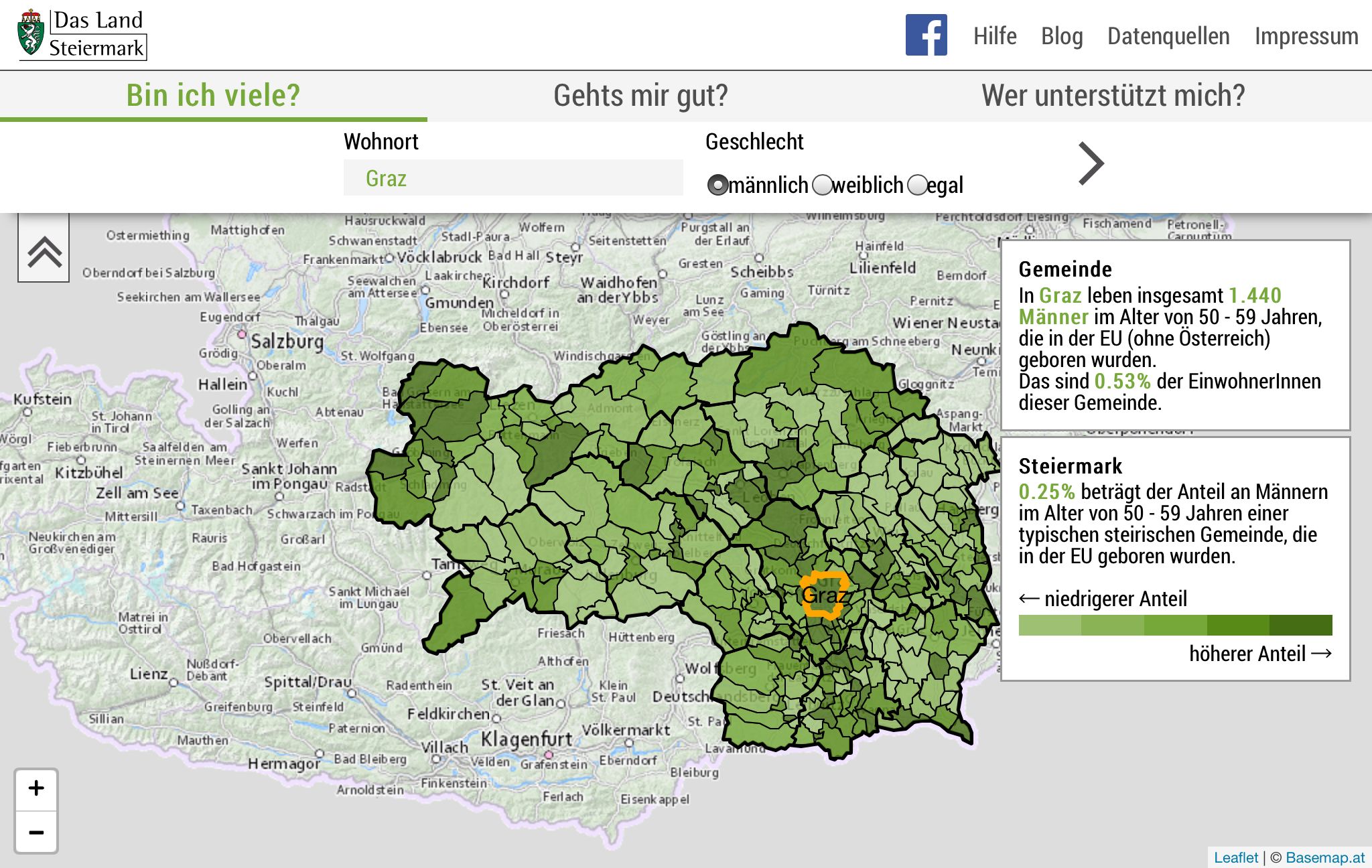
Responsive Choropleth Map (SVV)
Publications
- [And2018]
- Keith Andrews; Responsive Visualisation; Proc. MobileVis 2018 Workshop at CHI 2018, 21 Apr 2018, Montréal, Canada. Paper (PDF), Slides.
- [And2017]
- Keith Andrews and Aleš Smrdel;
Responsive Data Visualisation;
Proc. Eurographics / VGTC Conference on Visualization
(EuroVis 2017 Posters).
http://dx.doi.org/10.2312/eurp.20171182, Paper (PDF), Poster (PDF). - [And2016]
- Keith Andrews;
Responsive Data Visualisation;
Talk at Graphical Web 2016, Exeter, UK, 06 Nov 2016.
https://youtu.be/cQKzpKfea-E, Slides. - [And2015]
- Keith Andrews, Thomas Traunmüller, Thomas Wolkinger,
Robert Gutounig, and Julian Ausserhofer;
Building an Open Data Visualisation Web App
using a Data Server: The Styrian Diversity Visualisation Project;
Proc. 15th International Conference on Knowledge Technologies
and Data-Driven Business (I-Know 2015).
http://dx.doi.org/10.1145/2809563.2809596, Paper (PDF).
Acknowledgements
The Responsive Data Visualisation project is lead by Keith Andrews. Miran Levar, Johanna Pirker, Bernd Prünster, Werner Sturm, and Rizwan Mehmood built early versions of the responsive line chart, bar chart, and parallel coordinates examples. Gregor Christandl, Simon Kloiber, Matthias Link, and Lukas Skofitsch built the initial version of the responsive scatterplot example. Aleš Smrdel polished and improved the visualisations and ported them to D3 v4.
The SVV project was carried out in collaboration with the Provincial Government of Styria and FH Joanneum and Thomas Traunmüller developed its user interface.
Implementation
The example responsive line chart, bar chart, parallel coordinates,
and scatterplot visualisations are built with D3 v4. The Styrian
Diversity Visualisation is built with Leaflet and SVG and uses map
tiles from basemap.at.